ゆめかわ
Japanese Kawaii · Style Field Note
Yume Kawaii lets everything float.
Start with the spacing: pale colour, soft material, and a deliberate gap left around every object so that nothing presses on anything else.
Kawaii Kinds · Style Field Note · checked 2026-07-27
Compass Check
Read the spacing before you read the colour.
This Field Note keeps two things apart. What the style looks like is ours to describe, and we do. Where the name came from is not settled, and we say so rather than filling the gap.
01 · Understand
What is Yume Kawaii?
Yume kawaii, or ゆめかわいい, reads roughly as “dream-cute”. It is a pale, weightless register of Japanese kawaii: lavender and powder blue instead of hot pink, felt and satin instead of plastic, and objects that look like they are drifting rather than sitting.
Where the name came from is not verified. The checked record does not establish one first-person origin account, so this note leaves that line open. What is established is current first-party use: one of the shops below describes its own line, in its own words, as a dream-cute magical world.
02 · Understand
A small world
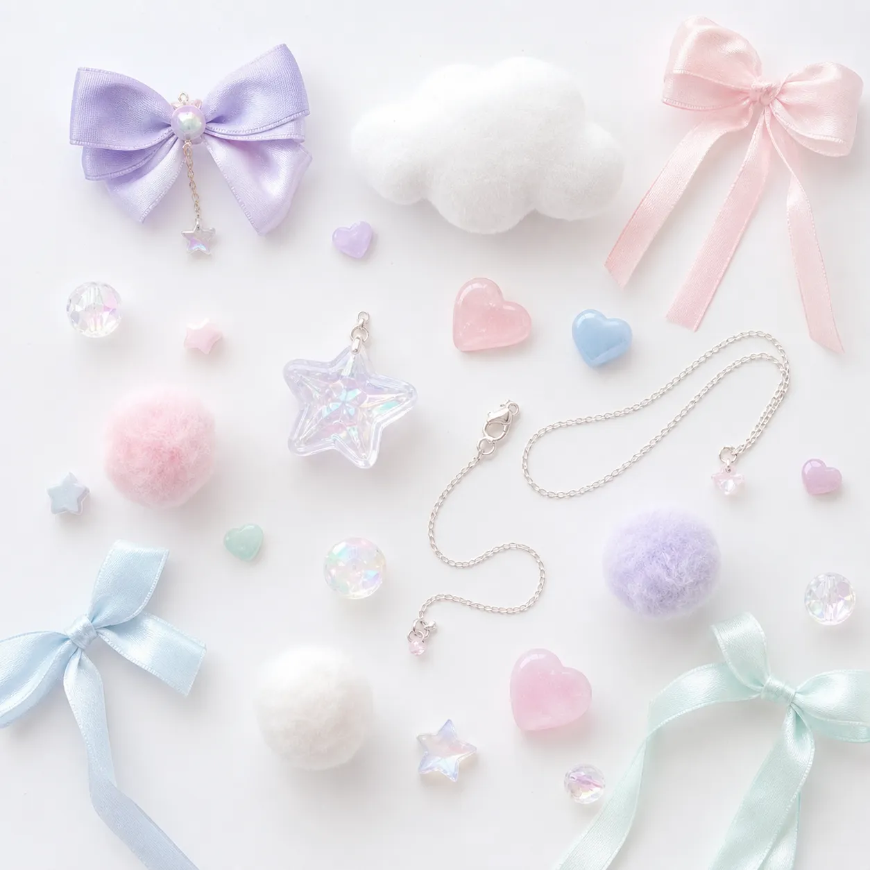
Look at the specimen above and notice what is not there. Nothing overlaps. A felted cloud, four satin ribbons, a large iridescent star, a handful of resin hearts, three pom-poms and one fine silver chain are laid out on white with real distance between them. Move any two of them together and the whole thing stops working.
That is the part people tend to miss. Yume kawaii is usually described by its palette, but the palette alone will not produce it — a crowded arrangement in exactly these colours reads as a craft supply drawer. The spacing is doing as much work as the colour, and so is the material: felt, satin, wool and frosted resin all catch light softly, so nothing in the frame has a hard edge.
03 · Look
Look for
These are the cues we use. They are an editorial reading, not a definition anyone has authorised — read them as a way of seeing, and drop any that stop being useful to you.
- Colour. Pale local colour rather than pastel tint. Each object is its own soft hue — lavender, powder blue, mint, shell pink — instead of one pink applied to everything.
- Space. Room is left around each object on purpose. If an arrangement is crowded, the register changes even when the colours do not.
- Material. Felt, satin, wool, frosted resin, iridescent plastic. Surfaces that scatter light rather than reflect it, and edges that stay soft.
- Motif. Clouds, stars, ribbons, hearts, unicorns. They appear as small charms rather than as a printed pattern, and usually one at a time.
04 · Check
Shops to check
A shop page is a place to verify its own current terms, not evidence that a particular item is available or suitable. Both pages below were reachable when checked on 2026-07-27.
Read them together and you learn something the dictionaries will not tell you: the two shops do not use the same word. One calls its line a dream-cute magical world in its own copy. The other runs the same visual territory under the name “PASTEL” and never says yume kawaii at all. The name is not settled in the shops either, and that is worth knowing before you go looking for it.
- LISTEN FLAVOR official MAGICAL line — Official shop
Official shop — check current stock, shipping and returns.
Checked
- ACDC RAG official PASTEL collection — Official shop
Official shop — check current stock, shipping and returns.
Checked
05 · Read next
Two notes now, and the gap between them.
With yami kawaii and yume kawaii both written up, the atlas finally lets you do the thing it was built for: hold two readings side by side and see where they part. Retro game kawaii and kimo kawaii are still cues rather than notes, and the atlas says plainly what is missing before either can be written.
Shop Dossier: ACDC RAG, whose PASTEL range is cited above
Return to Kawaii Style Atlas